Pulso has no home screen widgets yet, and the exercise that produced these was not a design exercise. It was checking, one face at a time, whether the app actually holds the data each one would need. Twelve designs went in. One came out cut, three came out flagged, and the reason is worth more than the pictures.
Everything below is drawn from the real collection: six watches, their own photographs pulled from the live database, the Omega Speedmaster on 43 wears, both Seikos still never worn, a collection worth £6,489 against £5,368 paid. No placeholder numbers, which turns out to be the whole point.
The daily act
choosing, and logging
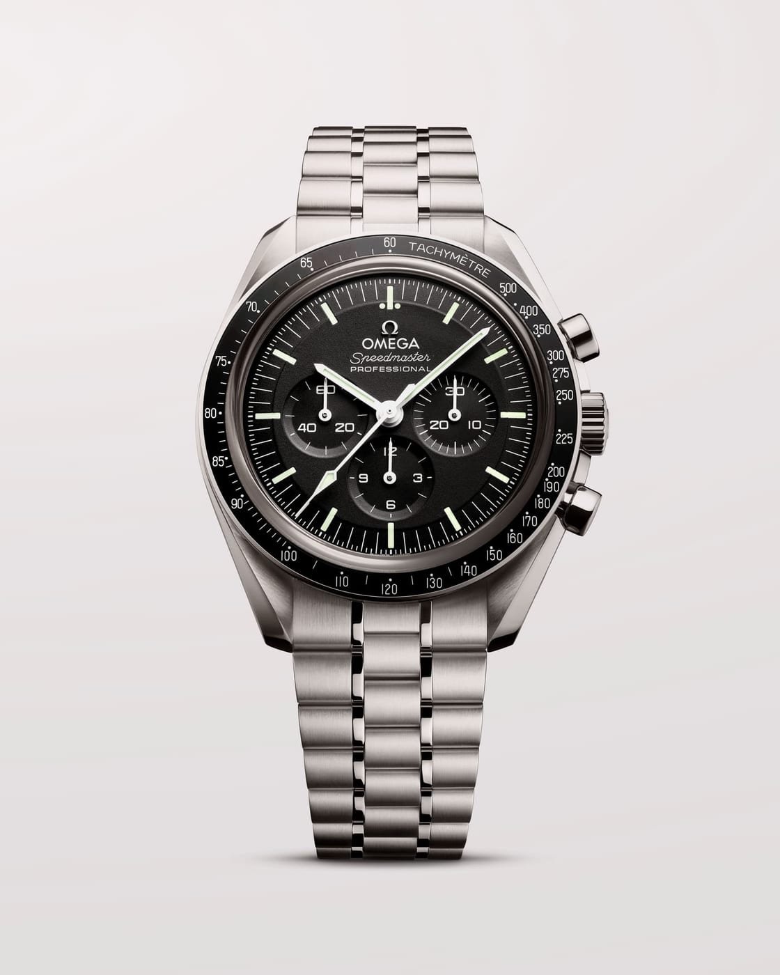
Professional
The wear button, on the home screen. Tap again to undo, because the endpoint is already a toggle and a mis-tap here is certain.
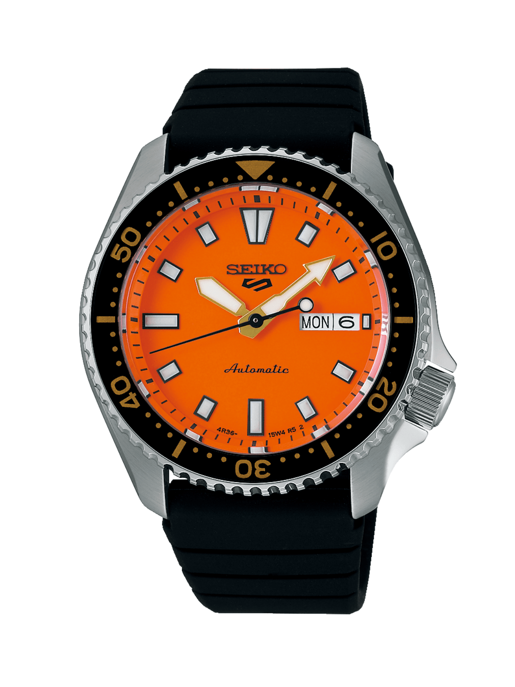
5 Sports
Segments, not a progress bar. It reads as an instrument because that is what it is. Quartz is excluded: a battery has no reserve.
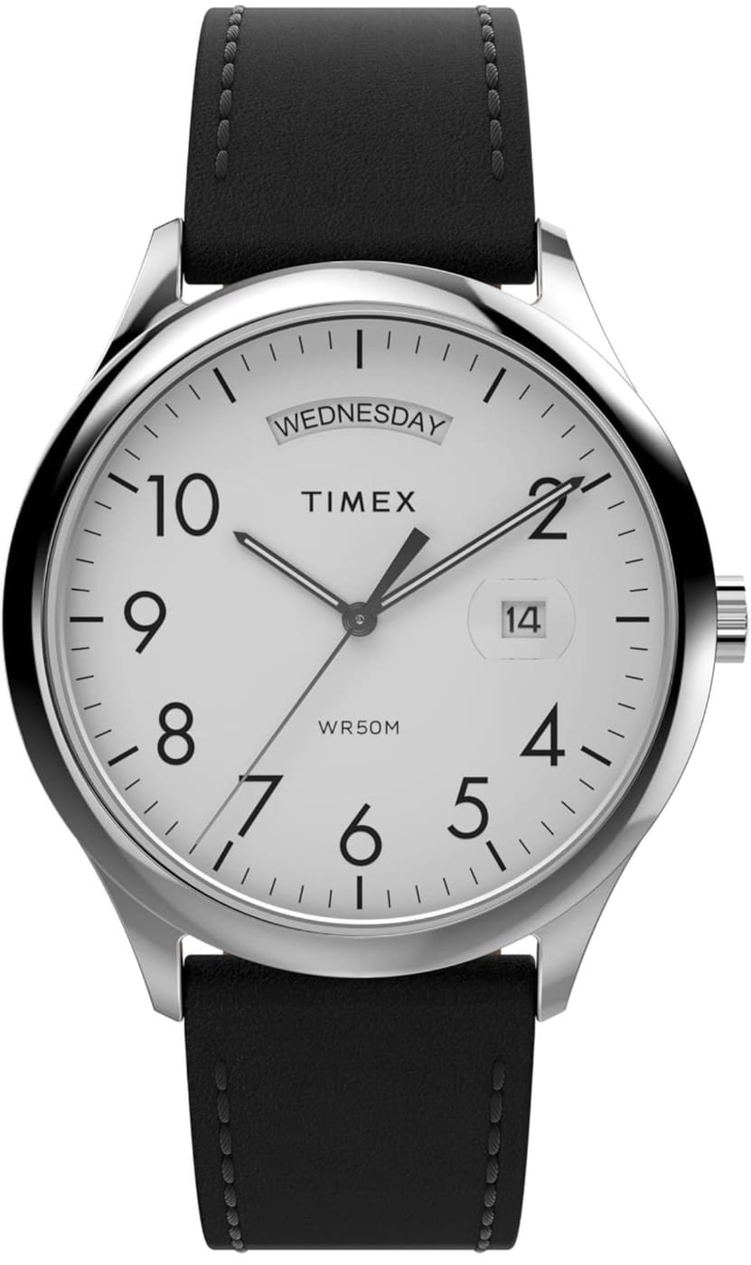
Easy Reader
Deliberately not the two never-worn Seikos. Never is a different state from neglected, and only one of them has a fix.
Choosing the watch
the part a pinned widget gets wrong
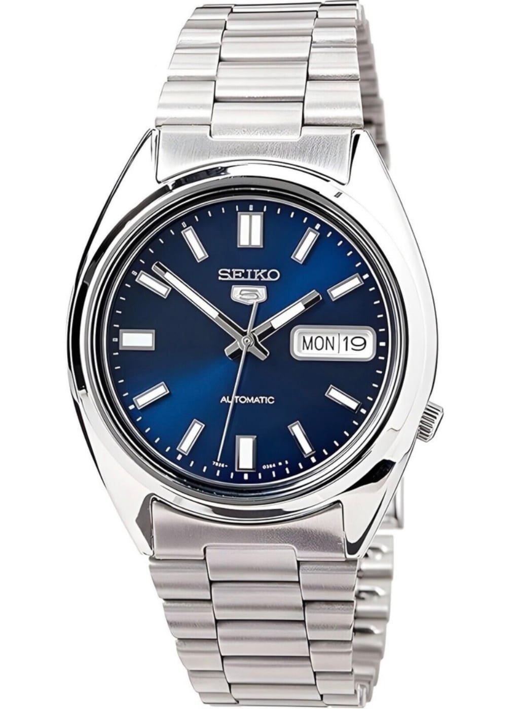
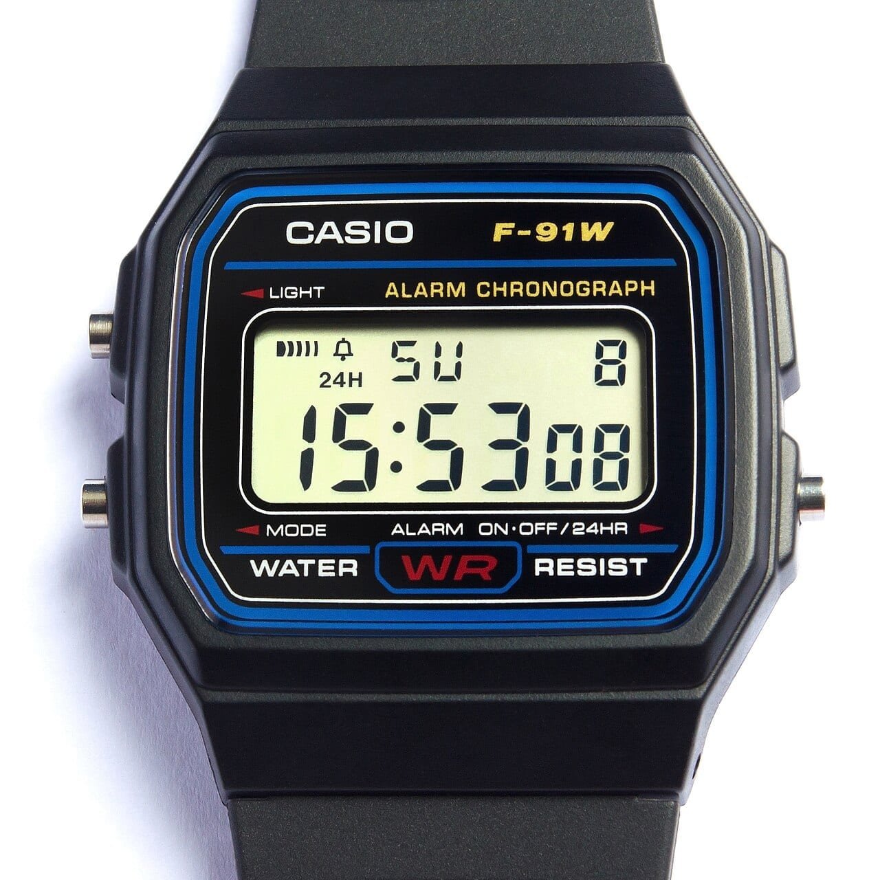
Every watch is its own button, so choosing and logging are the same tap. No configuration, no launch.
Value against outlay, both stored. No trend line, because nothing records an owned watch’s value over time.
The widget I cut had no data behind it. A complication counter looked good in the mockup, 23 complications across the collection, a neat row of glyphs. Pulso stores no complications and has no field they could be derived from. There is nothing to count. It would have been discovered during implementation instead, after the layout was built, which is the expensive time to find out.
A sparkline that cannot be drawn. The collection value widget shows £6,489 and the gain over what I paid, both of which are stored. It does not show a 30 day trend line, because pulso_price_history holds only rows tagged wishlist, nine of them. Value history for watches I own is not recorded anywhere. The shortlist sparkline elsewhere in the app is real; the owned one would have been a line drawn through a single point.
A field that exists and is empty. Next service was the third flag. The column is there, the app already flags anything five years overdue, and last_service is blank on all six watches. The widget would render nothing at all until I fill it in, which makes it a data-entry job rather than a build job.
The percentage I refused to ship. One design had a rotation health score of 92%, in a dial, with the word Excellent under it. I could not tell you what it measured. It now reads worn in 30 days, 4 of 6, which is a fact you can check against the rotation list rather than a grade you have to trust.
Selecting a watch is the actual hard part. A widget pinned to one watch is wrong five days out of six when you own six. The medium size solves it by giving every watch its own button, so choosing and logging are one tap, and the order has to be deterministic: these are tap targets, not a list, and if they reshuffle between refreshes then muscle memory logs the wrong watch. It reuses the app’s watch-of-the-day ordering, longest unworn first with ties broken on id, which was made stable back in August after an unstable comparator was picking a different watch on every render with no data change. The same bug in a widget writes a wrong wear entry instead of wobbling a list.
The rule I set before any of this gets built: no widget can spend a lookup. Pulso’s AI calls cost real money and are rationed, and a home screen surface refreshes on its own schedule without anyone asking it to. Everything here renders stored data or it does not ship.
Build order is what are you wearing, then still wound. They are the only two that change what I do rather than what I know, and neither needs anything the database does not already hold.
Get Useful Personal Tech by email. One short email a week: one piece of tech I’ve tested, and whether it’s worth buying, upgrading or skipping. Free, unsubscribe in one click.
